HR Software (Under NDA)
How I turned ideas to a demonstrable, trade-show-ready PoC in less than 3 weeks.
ROLE
Product Designer, UX/UI
TIMELINE
3 weeks (2025)
TEAM
8-10 person team
TYPE
Enterprise UX · B2B · B2C
To comply with my NDA, I've omitted and obfuscated confidential information. All views are my own and don't necessarily reflect those of the client.
OVERVIEW
What does it take to design an operational system when there is no domain knowledge, the brief doesn't exist, and the clock is already running?
A HR software and consulting startup in Germany had a vision for modernizing how temporary staffing agencies manage their daily operations. What they had was three high-level wireframes and a Miro board dense with technical terms, domain diagrams, and years of operational knowledge that had never been translated into product logic. My job was to turn that into something credible enough to take to a trade show — in less than three weeks.
MY APPROACH
Understand and reframe before touching screens.
Rather than wireframing right away, I went back to basics. I started with these four questions:
Who are the users we're designing for?
What are their core tasks?
How do they currently do them?
What does this PoC actually need to prove?
Map dependencies before mapping workflows: The first output was a diagram of how modules related to each other, what had to exist before something else could work, and where our understanding was still incomplete.
Scope around what matters, not what's possible: The risk was building the wrong things. Together with the PO and engineering leads, I scoped around two criteria: workflows critical to daily operations, and modules where wrong assumptions would cost the most to fix later.
Embed compliance logic into structure: Rather than designing around regulatory complexity, I built it directly into the workflow. Decision points driven by rules needed to be visible.
Align continuously: In a 3-week engagement, misalignment can be fatal. Strategic touchpoints with the PO, developers, and client decision-makers functioned as working sessions — surfacing gaps and testing assumptions throughout, not only at the final review.
DESIGN DECISIONS - SELECTED SCREENS
The operational core that the PoC focused on.
The system serves staffing agency managers handling placements, orders, contracts, and compliance — users operating under real regulatory and time pressure.
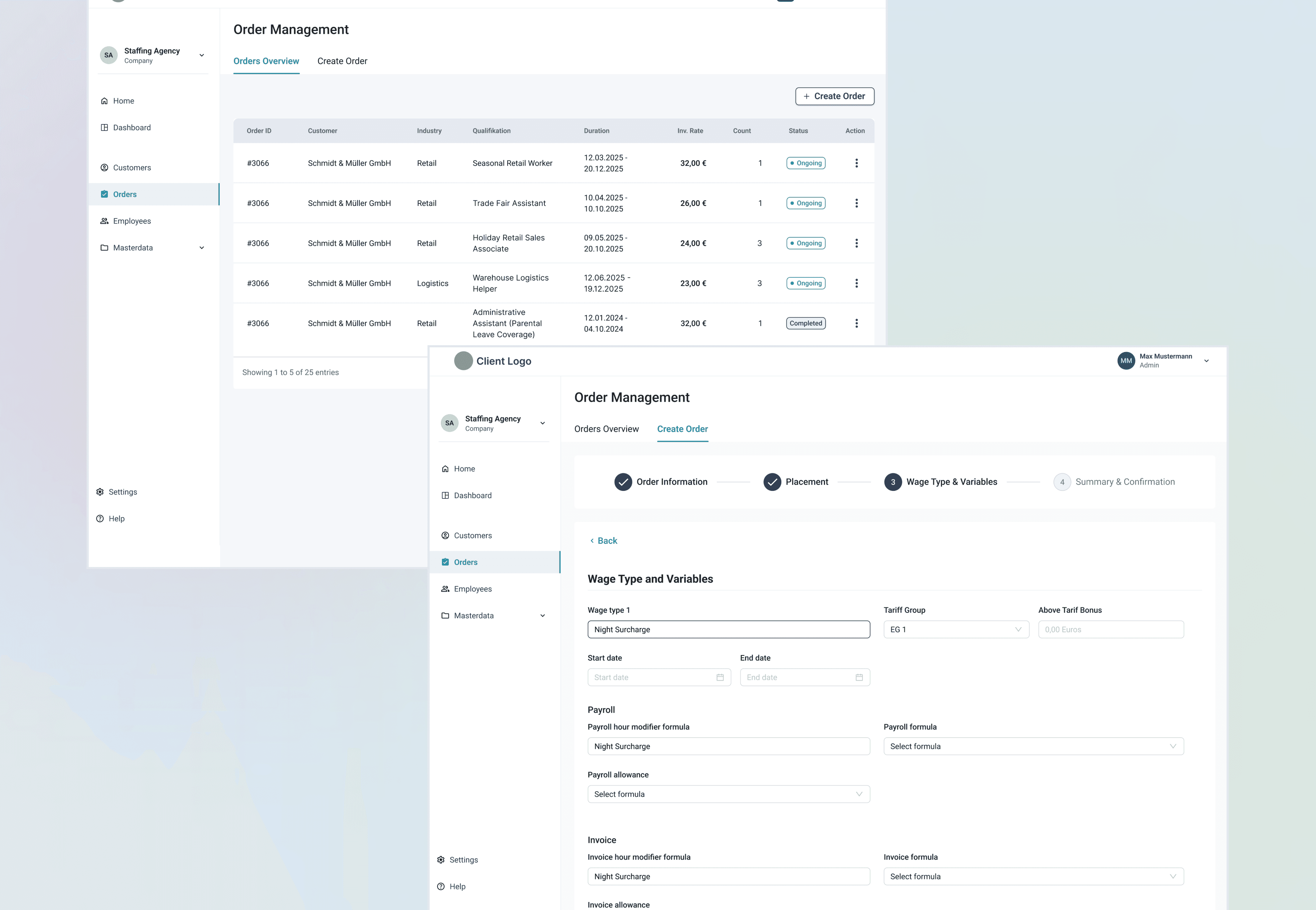
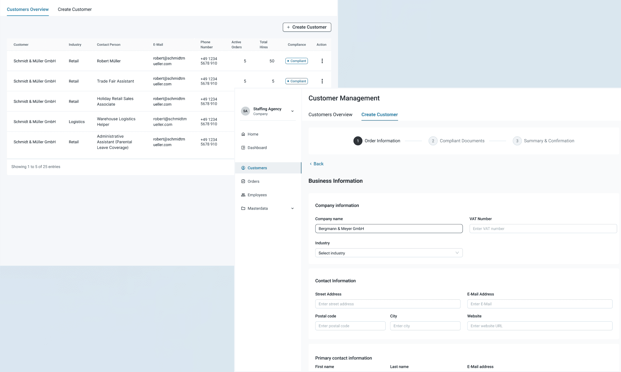
1. Placement & Customer Management
THE PROBLEM
With the full product scope still undefined, there was no obvious place to start. Starting in the wrong place meant building on foundations that hadn't been tested.
"How do we identify the right entry point — and prove that our dependency logic is correct — before we've built too much on top of it?"
SOLUTION
Identify the starting point of the workflow that is critical for everything to work. Placement & Customer Management is where it started - the module that everything either fed into or depended on.
BEFORE
Operational knowledge fragmented across a Miro board
No clear module sequence or dependency structure
No product logic — only domain knowledge
AFTER
Dependency map surfacing what had to exist before each module could function
Sequential workflow grounded in how decisions are actually made
A shared reference point for design, engineering, and client throughout the engagement
TRADE-OFF
Scope entry point
WE CHOSE
Start with the most interconnected module
Placement & Order Management was the hardest place to start — and the right one. If the logic held here, the rest of the system would follow. Building confidence in the foundation early was worth the early complexity.
VS
WE GAVE UP
Starting with something simpler
A less complex module would have felt like faster progress. But it would have deferred the hardest dependency questions — and the most expensive mistakes — until later in the engagement.
2. The Create Order screen
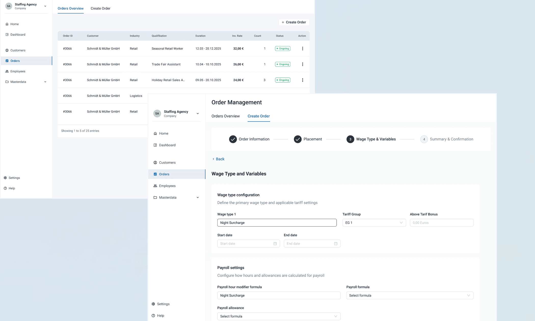
THE PROBLEM
Every major dependency in the system converged on this single screen. Business rules that shifted by contract type and tariff group. Fields that were only relevant in certain conditions. Prerequisite data that had to exist before an order could be created at all.
"How do we make a screen this complex feel navigable — without hiding the logic users need to do their job?"
SOLUTION
Surface only what's needed at each step. Structure the flow sequentially so users always know where they are and what's required next. Make compliance logic structural.
3. Component library
THE PROBLEM
With three weeks on the clock, a custom component library wasn't a real option. But a PoC that felt assembled under pressure wouldn't demonstrate the product credibly at a trade show.
"How do we move fast without producing something that looks and feels like a prototype?"
SOLUTION
Work with what the engineering team already knew. Material UI fit every dimension that mattered — familiar to developers, strong support for data-dense enterprise interfaces, accessible by default, extensible enough to grow into a mature design system. I customised core components and established a mini design library to maintain coherence across modules.
TRADE-OFF
Foundation for the UI system
WE CHOSE
Material UI, customised
Speed without sacrificing scalability. The dev team could move fast; the PoC looked and felt coherent; the foundation was extensible for the product that would follow.
VS
WE GAVE UP
A bespoke component library
A custom system would have given more control over visual identity. It would also have consumed a week of a three-week engagement. That tradeoff had one answer.
RESULTS & IMPACT
The PoC was completed on time and taken to a trade show to gather real market feedback — the original goal, delivered in full.
Beyond wireframes, the PoC:
Saved months of development by validating assumptions and surfacing gaps before engineering began
Enabled accurate roadmap planning through clarified workflows and realistic scoping
Gave the client a credible, demonstrable product to bring to market conversations
REFLECTION
Leading through ambiguity is an underrated design skill.
A well-scoped PoC looks like good execution. A junior designer who stayed productive looks like good mentorship. Assumptions caught early look like smooth collaboration. Some projects starts messy and sometimes, stay messy. Being able to navigate ambiguity and create conditions for success is the invisible part of design work that is often overlooked.
The skill I demonstrated here wasn't Figma proficiency or component architecture — it was knowing how to generate direction from noise, absorb uncertainty so the rest of the team didn't have to, and make consequential decisions with incomplete information.
