

A leading HR software and consulting provider in Germany aimed to modernize how temporary staffing agencies manage their daily operations. In 3 weeks, with no brief and a complex domain, we delivered a trade-show-ready PoC that changed how the client thought about their own product.
CLIENTHR Software (Under NDA)
DURATION3-week (March 2025)
MY ROLEProduct Designer, UX, UI
TEAM8-10 people
To comply with my non-disclosure agreement, I have omitted and obfuscated confidential information in this case study. All information in this case study is my own and does not necessarily reflect the views of the client.Setting the stage

The client had a vision — three high-level wireframes and a massive Miro board filled with technical terms, domain diagrams, and years of operational knowledge that had never been translated into product logic. What they didn't have was clarity on where to start.
We had 3 weeks, a language barrier that made communication harder than it should have been, a junior designer who needed direction, and no brief beyond the board in front of us.
My first move wasn't wireframing right away. It was to understand and reframe.
Rather than attempting to absorb the entire Miro board at once, I went back to basics: Who are the users we're designing for? What are their core tasks? How do they currently do them? What does this PoC actually need to prove?
Those four questions gave the project a spine when nothing else could. They let me cut through the domain complexity and identify what mattered most — not the full product vision, but the operational core that would make the PoC credible to real users and useful to the client's roadmap.
The result was a scalable, operational PoC that validated core assumptions, clarified system logic, accelerated roadmap planning, and gave the client something concrete enough to take to a trade show for real market feedback.
Key challenges I solved

1. Synthesizing scattered operational knowledge into product logic
This was the hardest problem on the project — and the one everything else depended on.
The client's operational knowledge existed in fragments: technical terms, domain diagrams, years of process logic spread across a Miro board that had never been pressure-tested as a product. My job was to turn that into something a design and engineering team could actually build from.
I started by mapping dependencies between modules — not designing screens, but understanding what needed to exist before something else could work. Wage conditions can't be applied without placement records. Placements can't exist without employee and contract data. Getting this sequence wrong wouldn't just affect one screen — it would cascade across the entire system.
The constraint that made this genuinely difficult was validation speed. In a 3-week engagement, there's no time to confirm every assumption before acting on it. Early on, I missed a dependency that created rework — a sharp reminder that in a domain this interconnected, a wrong assumption doesn't stay contained. I adjusted my approach: mapping dependencies more explicitly before moving to workflows, and treating each client touchpoint as a chance to stress-test my model rather than just present progress.
2. Translating dense business rules into scalable workflows
Temporary staffing in Germany is governed by strict regulatory logic — tariff groups, wage conditions, agency contracts, branch-specific compliance rules. These aren't edge cases. They're the core of how the system needs to behave.
Rather than designing around this complexity, I built it directly into the workflow structure — identifying where rules created decision points for users, ensuring those points were visible, and designing patterns flexible enough to accommodate rule variations without requiring entirely new flows each time.
3. Prioritizing PoC scope for maximum value
With the entire potential product space in front of us, the risk wasn't building too little — it was building the wrong things. A PoC that demonstrated breadth but couldn't prove operational logic would have been useless to the client's roadmap and unconvincing at a trade show.
Together with the PO and engineering leads, I scoped around two criteria: workflows critical to day-to-day operations, and modules where wrong assumptions would be most costly to fix later. Everything else was deliberately deferred.
4. Leading a junior designer through ambiguity
I was navigating uncertainty myself while simultaneously making sure they could execute without getting lost in it. My approach was to walk them through my reasoning before each decision — not just what we were designing, but why, and what we were trading off. This kept them productive without requiring them to absorb the full complexity of the domain at once, and meant their work stayed coherent with the broader system logic even when they are working independently.

Decisions and design rationale

1. Map user tasks and flows before touching screens
With time pressure pushing everyone toward immediate output, my first instinct was to slow down just enough to avoid expensive mistakes.
Before designing a single screen, I created a diagram mapping user tasks, flows, and the requirements at each step. This wasn't a deliverable — it was a thinking tool. It made visible how screens connected to each other, where dependencies existed, and what was still missing or not quite right in our understanding of the system.
The PO mentioned it showed him something he hadn't considered before — a signal that even in a team with deep technical knowledge, a user-centred view of the end-to-end journey adds something distinct. That shared picture became the reference point the entire team — design, engineering, and client — worked from for the rest of the engagement.
In complex enterprise projects, alignment on the problem is more valuable than early screens. This was the moment that proved it.
2. Start with Placement & Order Management
With the dependency map established, the starting point became clear. Placement & Order Management sat at the intersection of the most critical user workflows — the module everything else either fed into or depended on. Starting here meant our foundational design decisions would be stress-tested early, before we'd built too much on top of them.
3. Build regulatory logic into workflow structure, not around it
The temptation with complex compliance rules is to treat them as constraints to work around — edge cases to handle later. I treated them as the opposite: core logic that had to be embedded into workflows from the start.
This meant identifying where rules created genuine decision points for users, designing those moments explicitly rather than burying them, and building patterns flexible enough to accommodate rule variations without requiring entirely new flows. The goal was a system where compliance wasn't a layer added on top — it was structural.
4. Adopt Material UI for speed without sacrificing scalability
With 3 weeks on the clock, a custom component library wasn't a real option. I worked with the engineering team to identify what they already knew and could move fast with. Material UI fit on every dimension that mattered — familiar to the dev team, strong support for data-dense enterprise interfaces, accessible by default, and extensible enough to grow into a mature design system.
I customised core components and established a mini design library to maintain consistency across modules — ensuring the PoC felt coherent rather than assembled under pressure.
5. Embed alignment into the process, not after it
In a 3-week engagement, misalignment discovered late is fatal. I ran weekly touchpoints with the PO, developers, and client decision-makers — not as status updates, but as working sessions where assumptions got tested and gaps surfaced early. This kept the PoC grounded in both business logic and technical feasibility throughout, rather than converging on that only at the end.

Business impact (qualitative + estimated)
The outcomes of a 3-week engagement are rarely quantifiable — but the qualitative signals were clear.
The PoC was completed on time and used by the client at a trade show to pitch the product and gather real market feedback — the original goal, delivered in full. More telling was the shift in the room at our final meeting. The client's lead stakeholder, who had been measured and reserved throughout the engagement, was visibly different — warm, open, enthusiastic. Whatever distance existed at the start had closed entirely by the end.
In concrete terms, the PoC:
Saved months of development by validating assumptions and surfacing gaps before engineering began
Enabled accurate roadmap planning through clarified workflows and realistic scoping
Gave the client a credible, demonstrable product to bring to market conversations — built in 3 weeks from a Miro board with no brief.

Selected screens
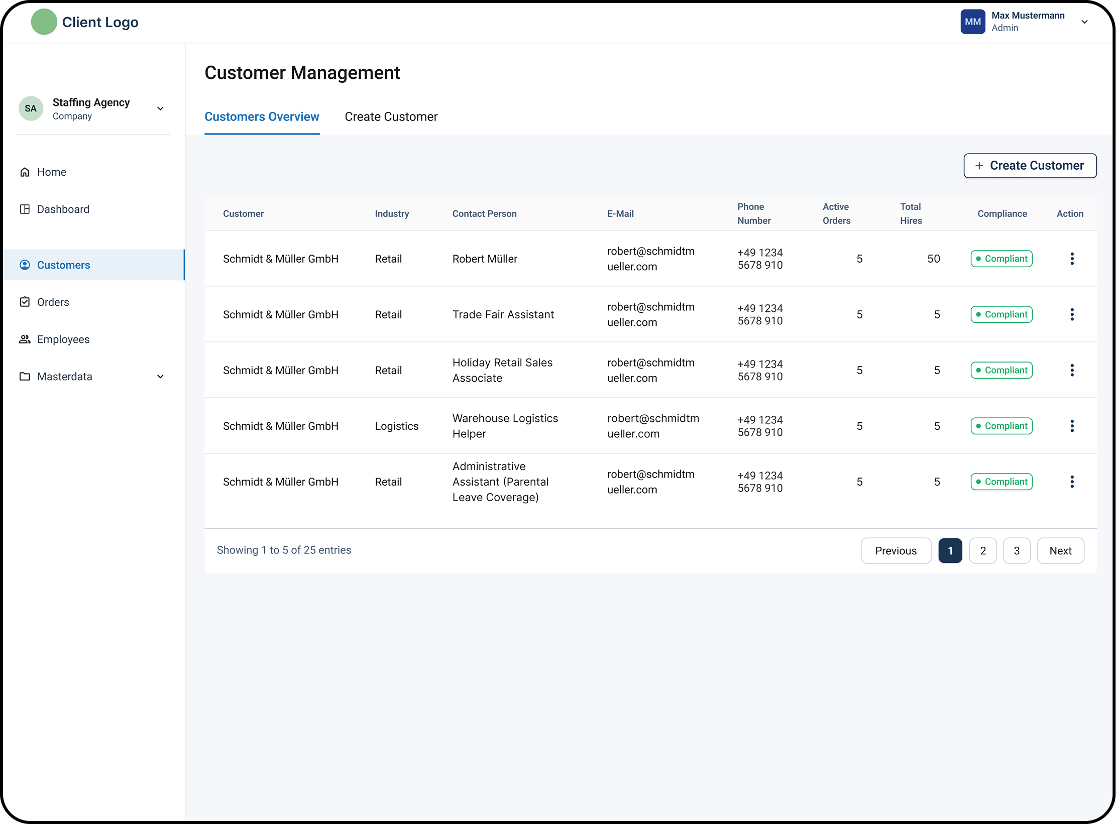
Customer & order management
The Create Order screen was the most complex in the entire PoC — and deliberately so. Every major dependency in the system converged here: business rules that shifted depending on contract type and tariff group, prerequisite data that had to exist before an order could be created, and fields that were only relevant in certain conditions.
The solution wasn't to simplify the complexity — it was to make it navigable. I surfaced only what was needed at each step, hiding fields that weren't yet relevant, and structured the flow sequentially so users always knew where they were and what was required next. The goal was a screen that felt straightforward to use despite the logic running underneath it — one that guided users through the right sequence without making the system's complexity their problem to manage.
This screen was also the clearest test of whether the dependency mapping had been done correctly. If the flow held up here, the rest of the system would follow.


Let’s work together
Working on something complex? I'm currently open to product design roles in Berlin and remotely.