

A Berlin solar panels company facing a tougher market needed more from their acquisition funnel — not just more leads, but better ones. I joined through TrueNode as an external product designer, embedded in the team responsible for the Wizard, their lead generation form. Over three months, I worked across the entire funnel: from the form itself to the pages designed to bring people to it.
CLIENTGreentech startup (under NDA)
DURATION3 months (2023)
ROLEExternal UX Designer
TEAM7-8 person team
To comply with my non-disclosure agreement, I have omitted and obfuscated confidential information in this case study. All information in this case study is my own and does not necessarily reflect the views of the client.Setting the stage
The client is a Berlin-based B2C solar panels company offering end-to-end photovoltaic solutions for homeowners across Germany. In 2023, the market shifted — new competitors entered the space and a change in government energy policy put price sensitivity at the centre of every customer's decision.
Their response was to double down on growth. Specifically, on the quality of leads entering their sales pipeline. The main acquisition channel was a lead generation form embedded across their website and landing pages — internally called the Wizard. Completing it was the first step for any potential customer before a sales consultant would reach out.
I was brought in through TrueNode as an external product designer to support the product team while they hired a permanent designer. I was placed in the team responsible for the Wizard, working closely with a PM, a tech team of around 5–6 engineers, occasionally an internal designer, a marketing exec and a CRO manager. My work sat at the intersection of product and CRO.
Are we solving the right problem?
Before touching anything, I wanted to make sure we were solving the right problems. "Fix the form" wasn't a brief I was willing to take at face value.
I ran a design sprint with the PM, tech lead, an internal designer, and an engineer to align on what was actually broken. Two things became clear.
The funnel had a motivation problem. Customers came to the Wizard wanting one thing — to know how much solar panels installation would cost for their home. But the form gave them nothing back until a sales consultant called days later.
The leads that did come through were too thin to work with. The sales team was regularly rejecting customers after qualification calls because there wasn't enough information to generate a reliable quote. Customers who filled in the entire form and still got no answer were understandably frustrated.
The insight that tied it together: fixing conversion and fixing lead quality weren't two separate problems. They were the same problem from different directions. That framing shaped everything that followed.
Fixing the value exchange
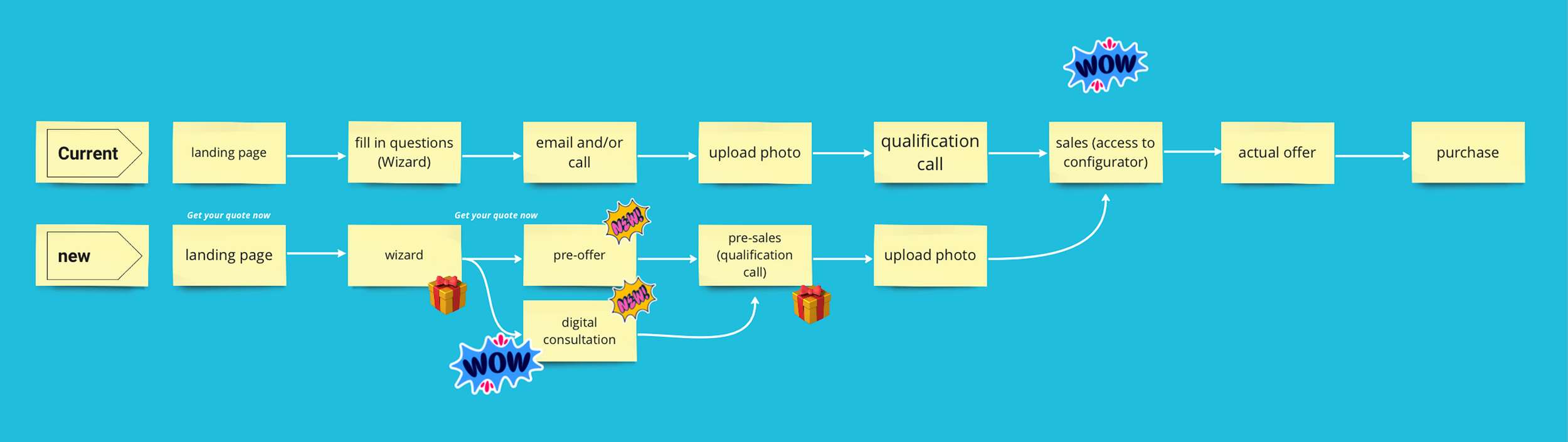
Provide 'wow' moment earlier in the process, instead of withholding it.The first thing we changed was the value exchange.
Instead of asking potential customers to fill in a lengthy form and wait for a call, we introduced a pre-offer screen mid-flow — a price estimate based on the information already provided. What solar solution fits your home, what it costs, the difference between paying outright versus financing, and your projected annual savings on electricity bills. Something concrete, before anyone picks up the phone.
The logic was simple: people were dropping off because the form felt like a one-way transaction. Give them something worth completing it for, and completion rates should follow. I also added a progress indicator throughout the form — a small detail, but an important one. It gave users a sense of momentum and made the end feel reachable.
We ran the new version for two weeks. The results were encouraging enough to move forward.
Initiative 1: Redesigning the Wizard

Making a complex question feel simple
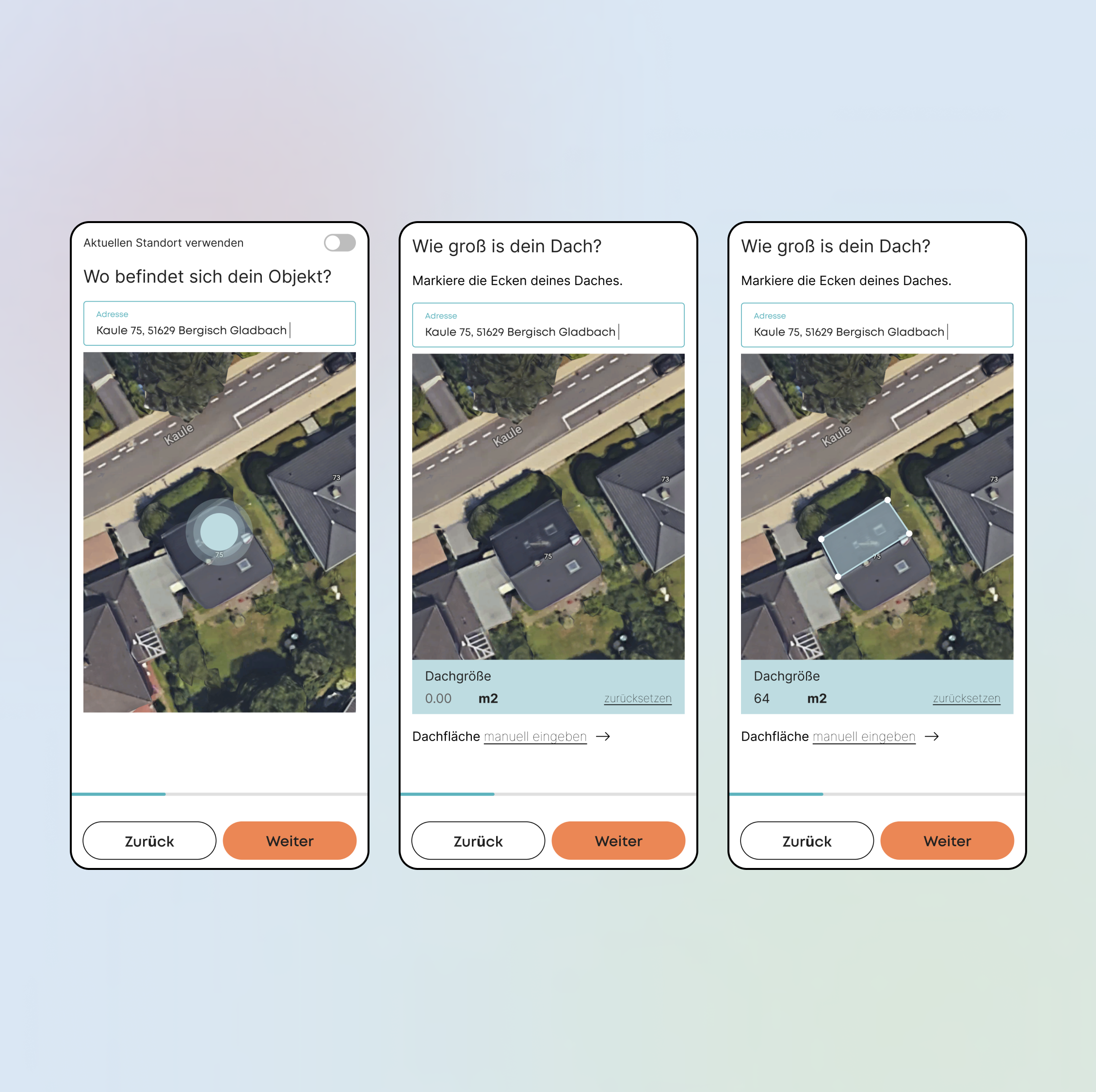
With the pre-offer running, the next problem was accuracy. Two questions in the Wizard were causing issues: roof size and roof angle. Both affect the number of panels needed and the viability of installation — but most people simply don't know the answers off the top of their head. The result was guesswork, which meant imprecise quotes, which meant more rejections from the sales team.
The fix was a roof area calculator embedded directly in the flow. I looked at how competitors were handling this. Two things stood out:
they used simple visual references to explain why they were asking. For example, a flat roof is illustrated at 0–15°, a standard roof at 15–30°, a pitched roof at 30°+
they used satellite imagery to remove the guesswork entirely. We followed the same logic, with the goal of making a technically complex question feel effortless to answer.
Customers enter their address, a satellite image loads, they map their roof. No guessing. The data captured is precise enough to generate a reliable estimate.
Initiative 2: The roof area calculator
Giving the funnel a coherent story
The team had already done an audit before I joined and flagged several things to improve. But looking at it myself, the issues felt surface-level and scattered. There was no clear thread connecting the page to the Wizard — no reason for a visitor to want to fill it in.
My instinct was to treat the homepage as the first chapter of a story that ended with the customer starting the Wizard. For that to work, the page needed to answer three things in order: what are you offering, why should I care, and why should I trust you.
I worked with the existing component library rather than designing new elements — faster, and consistent with what was already live. What I changed was the sequence and the narrative logic.
Given the policy change and the market mood at the time, price and long-term savings were front of mind for anyone considering solar. So the story led with that:
A solution that fits your home and budget, with up to €2.000 saved annually on electricity bills → Trust signals in the form of ADAC endorsement, Testsieger PV-Anbieter 2023 → Display value along with the first entry point to the Wizard → Social proof in the form of customer reviews → Showing our coverage using a regional map → FAQ to catch anyone still on the fence.
Every section earned its place by moving the visitor one step closer to starting the Wizard. The landing pages followed the same logic, adjusted for the specific campaign context.
Initiative 3: Homepage and Landing pages

Reducing friction without losing the data
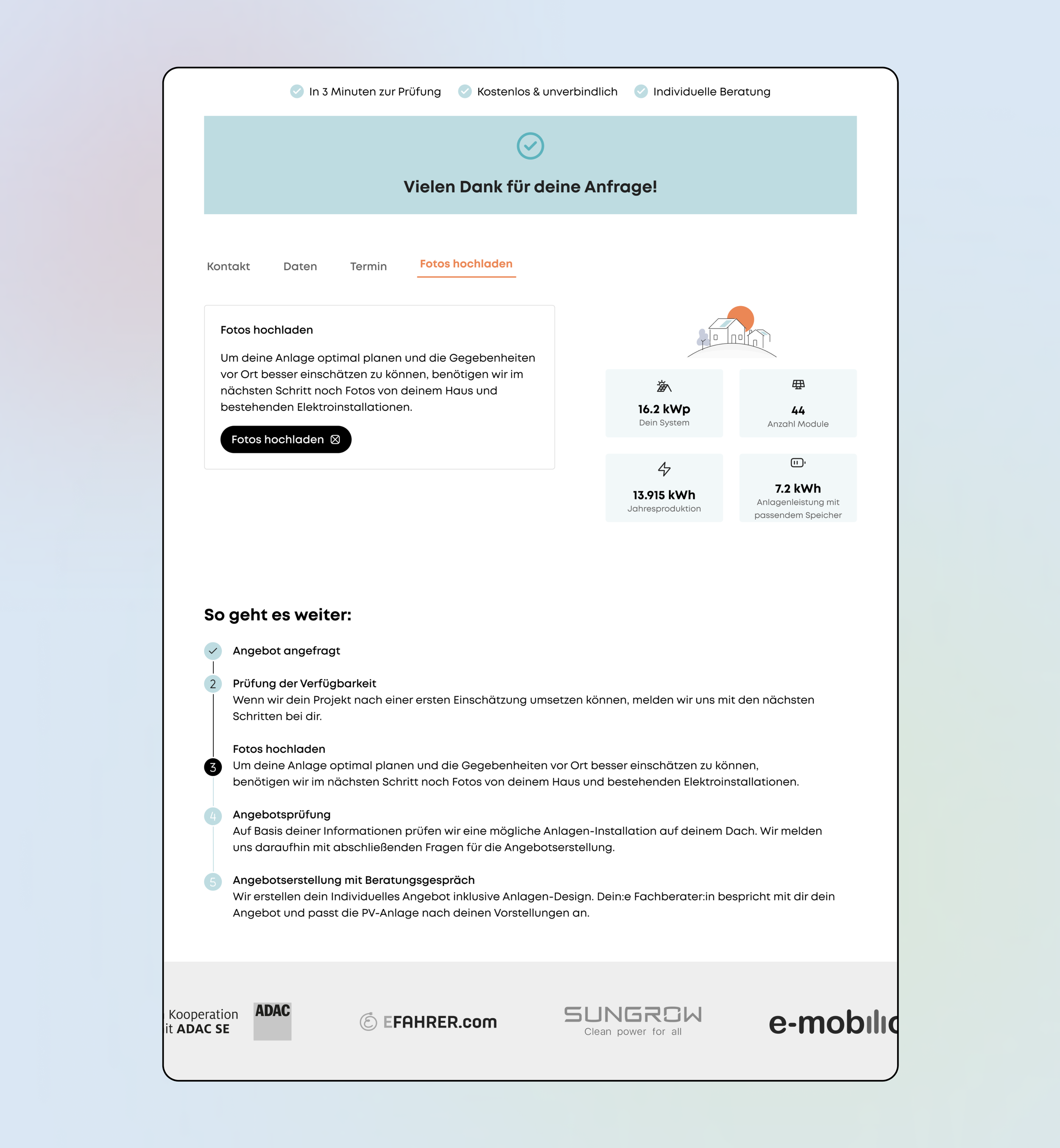
The previous flow asked customers to upload photos of their home early — before the qualification call. It was necessary for the sales team to assess the installation properly, but placing it upfront added friction at exactly the wrong moment.
The hypothesis was simple: what if we moved it to after the Wizard was completed? By that point, the customer had already committed. Asking for one more thing felt less like a barrier and more like a natural next step.
I designed this as part of the success page — the screen customers land on after submitting the Wizard. Rather than just a confirmation message, the page showed a summary of everything they'd provided: contact details, home information, and their automatically scheduled phone appointment. The photo upload sat at the end of that summary, framed as a way to help give them a more accurate assessment.
The positioning mattered. It wasn't a requirement — it was an offer. Upload now to get a better quote. That framing reduced resistance without removing the value of the data for the sales team.
This was the last initiative I completed before the end of my contract. Post-launch data wasn't available to me, but the design was delivered, reviewed, and handed over ready for testing.
Initiative 4: Photo upload PoC
What three months across a full funnel taught me
Outcomes & reflection
As an external contractor embedded for a defined engagement, post-launch analytics weren't within my purview. The Wizard iterations showed positive early signals within the first two weeks of testing, and all four initiatives were delivered, reviewed, and signed off by the team.
The more valuable takeaway for me was about scope. In three months, working across a full acquisition funnel — form, success page, homepage, landing pages — the connecting thread was always the same question: does this move the right customer one step closer to completing the Wizard? Keeping that as the filter made it easier to make decisions quickly and stay coherent across initiatives that could have easily felt disconnected.
Running the design sprint at the start was the right call. Not only were we moving fast, we were moving in the right direction.

Let’s work together
Working on something complex? I'm currently open to product design roles in Berlin and remotely.